Netlify CMS 2.4.0 brings deploy preview links!

Netlify CMS 2.4.0 brings deploy preview links!

Seeing is believing

The editorial workflow allows editors to create draft content in Netlify CMS, and Netlify can provide deploy previews of draft content, but there hasn’t been a way to access links to these preview builds from within Netlify CMS. The preview pane in the editor is a good tool for seeing how content will look on the site, but in the words of Marvin Gaye, “ain’t nothing like the real thing!” As Mr. Gaye bemoaned the absence of his beloved, so content creators long for the warm embrace of an actual production build. Their words, not ours.

Solution: GitHub Statuses

For sites using the GitHub (or Git Gateway with GitHub) backend, we now have deploy preview links in the CMS using the GitHub Statuses API. Many static sites already have continuous deployment and deploy previews configured on their repo, and they often use statuses to provide a link to a deployment directly from a commit or pull request. To retrieve a commit status that provides a deploy preview URL, we check for a status whose “context” contains one of a list of keywords commonly associated with deploy previews.

If a status is not found, nothing happens in the UI. If a status is found, but the deploy preview isn’t ready, we provide a “Check for Preview” link, allowing the content editor to manually check back until the preview is ready:

When the preview is ready, the “Check for Preview” button is replaced with a link to the content:

Deploy preview links generally direct to the root of a site, but Netlify CMS can also link straight to the piece of content being edited. By providing a string template for each collection, you can get links that go right where editors expect them to. More complex URL’s can be constructed using date information from your content files.

Unpublished vs. published

If you’re not using the editorial workflow, you may not feel you need this very much. Whenever you save content, it’s immediatlely published, so you can navigate to your live site to see the changes. That said, it’s at least convenient to have a link direct to your content from the CMS, so deploy preview links can also work for CMS installs that do not use the editorial workflow. Instead of retrieving a URL from a commit status, this functionality requires setting a site_url in your config, and that URL is used in place of the deploy preview URL.

GitLab and Bitbucket

Support is coming soon for these two awesome backends! Stay tuned.

Try it out!

Deploy preview links are live in Netlify CMS 2.4.0. Please give them a try and let us know if you have any problems by opening an issue or reaching out in our community chat!

Netlify CMS now supports GitLab as a backend

Netlify CMS is releasing support for GitLab as a backend, creating the world’s first completely open source stack for Git-based content editing.

We heard you (and you, and you, and you)! While you want to use Netlify CMS as the headless content management system for your Jamstack projects, all of your code lives in GitLab. Our long-term vision is to be tool-agnostic so you can use whatever tool helps you work best. But while you can already use Netlify CMS with most static site generators, backend support was limited to GitHub.

Immediately after the December release of Netlify CMS 1.0, contributors got to work on improving the API for backend integrations. At the urging of the community, we prioritized support for GitLab. With today’s release of Netlify CMS 1.9.0, you can now use GitLab as the backend for Netlify CMS.

Adding support for GitLab means that millions more developers can now use Netlify CMS with their projects. Seriously — millions. GitLab is used by more than 100,000 organizations like Ticketmaster, Intel, Red Hat, and CERN.

How it works

Netlify CMS is an open source content management system for your Git workflow that enables you to provide editors with a friendly UI and intuitive workflow. You can use it with any static site generator to create faster, more flexible web projects. Content is stored in your GitLab repository alongside your code for easier versioning, multi-channel publishing, and the option to handle content updates directly in Git.

In case you want an even easier way to get started, or just want to poke around in the code, you can use the button below to automatically deploy a starter site that uses the Hugo static site generator along with Netlify CMS.

Lastly, one particularly exciting thing about using GitLab as your backend is that it doesn’t require an authentication server. While the GitHub integration requires a hop to an authentication server (something Netlify provides for most users), GitLab’s implicit auth flow allows you to connect directly from your browser to gitlab.com, or even to your own self-hosted GitLab server!

What’s next

We’re already working toward Bitbucket support and will be releasing it as soon as possible! We’re also focused on the upcoming release of Netlify CMS 2.0, which will bring new image handling features and improvements, and improved APIs for better CMS extensions. We’re also looking for more ideas and helping hands, so if you’re keen to build a smarter, safer, and more scalable CMS, we’d love your contributions. Give us a shout on Twitter or in community chat if you have questions or ideas.

Jekyll

Introduction

This section will help you integrate Netlify CMS with a new or existing Jekyll project.

Jekyll is a blog-aware static site generator built with Ruby. Github Pages are powered by Jekyll, making it a popular choice for developer blogs and project pages.

If you’re starting a new project, the fastest route to publishing on a Jekyll website with Netlify CMS is to deploy a template on Netlify.

Setup

This guide will use the blog you get if you follow the really excellent official Jekyll step by step tutorial as a starting point. If you’re new to Jekyll – I recommended you start by following the tutorial so you know your way around your new blog. Otherwise you can clone this repo and checkout the without-cms branch.

Add Netlify CMS

Add admin/index.html

Create a file admin/index.html in the root of your repo – it should look like this:

<!-- admin/index.html -->
<!DOCTYPE html>
<html>
  <head>
    <meta charset="utf-8" />
    <meta name="viewport" content="width=device-width, initial-scale=1.0" />
    <title>Content Manager</title>
    <!-- Include the identity widget -->
    <script src="https://identity.netlify.com/v1/netlify-identity-widget.js" type="text/javascript"></script>
  </head>
  <body>
    <!-- Include the script that builds the page and powers Netlify CMS -->
    <script src="https://unpkg.com/netlify-cms@^2.0.0/dist/netlify-cms.js"></script>
  </body>
</html>

Add admin/config.yml

Create a file admin/config.yml in the root of your repo – it should look like this:

# config.yml

backend:
  name: git-gateway
  branch: main # Branch to update (optional; defaults to master)
media_folder: 'assets/uploads'
collections:
  - name: 'blog'
    label: 'Blog'
    folder: '_posts/'
    fields:
      - { name: Title }

Enable authentication for CMS users

Netlify CMS stores content in your online Git repository. Therefore, to make content changes, users need to authenticate with the corresponding Git provider to prove that they have read and write access to that content.

Follow the directions in the Introduction section to enable Netlify Identity and Git Gateway services for the backend, then add the Identity widget to render a login portal on the frontend.

CMS Configuration

Blog Collection

We’ll start by updating the blog collection. Blogging is baked into Jekyll, and the _posts/ directory uses some special conventions we’ll need to keep in mind as we configure Netlify CMS. Copy and paste the following into your config.yml.

collections:
  - name: 'blog'
    label: 'Blog'
    folder: '_posts/'
    create: true
    slug: '{{year}}-{{month}}-{{day}}-{{slug}}'
    editor:
      preview: false
    fields:
      - { label: 'Layout', name: 'layout', widget: 'hidden', default: 'post' }
      - { label: 'Title', name: 'title', widget: 'string' }
      - { label: 'Publish Date', name: 'date', widget: 'datetime' }
      - { label: 'Body', name: 'body', widget: 'markdown' }

A few things to note.

  • We set the slug to '{{year}}-{{month}}-{{day}}-{{slug}}' because Jekyll requires this format for blog posts. year, month, and day will be extracted from the date field, and slug will be generated from the title field.
  • We added editor configuration with a field preview: false. This will eliminate the preview pane. Because Jekyll uses Liquid templates, there currently isn’t a good way to provide a preview of pages as you update the content.
  • The layout field default is set to post so Jekyll knows to use _layouts/post.html when it renders a post. This field is hidden because we want all posts to use the same layout.
  • The date and title field will be used by the slug – as noted above, Jekyll relies on the filename to determine a post’s publish date, but Netlify CMS does not pull date information from the filename and requires a frontmatter date field. Note Changing the date or title fields in Netlify CMS will not update the filename. This has a few implications:
    • If you change the date or title fields in Netlify CMS, Jekyll won’t notice
    • You don’t necessarily need to change the date and title fields for existing posts, but if you don’t the filenames and frontmatter will disagree in a way that might be confusing
    • If you want to avoid these issues, use a regular Jekyll collection instead of the special _posts directory

Author Collection

In addition to _posts, the Jekyll tutorial blog includes a collection of authors in the _authors directory. Before we can configure Netlify CMS to work with the authors collection, we’ll need to make a couple tweaks to our Jekyll blog. Here’s the front matter for one of the authors.

short_name: jill
name: Jill Smith
position: Chief Editor

name has special meaning as a unique identifier in Netlify CMS, but as set up now our Jekyll blog is using short_name as the unique identifier for authors. For each author, update the frontmatter like so.

name: jill
display_name: Jill Smith
position: Chief Editor

then update _layouts/author.html, _layouts/post.html and staff.html accordingly.

<!-- _layouts/author.html -->
--- layout: default ---

<h1>{{ page.display_name }}</h1>
<h2>{{ page.position }}</h2>

{{ content }}

<h2>Posts</h2>
<ul>
  {% assign filtered_posts = site.posts | where: 'author', page.name %} {% for post in
  filtered_posts %}
  <li>
    <a href="{{ site.baseurl }}{{ post.url }}">{{ post.title }}</a>
  </li>
  {% endfor %}
</ul>
<!-- _layouts/post.html -->
--- layout: default ---

<h1>{{ page.title }}</h1>

<p>
  {{ page.date | date_to_string }} {% assign author = site.authors | where: 'name', page.author |
  first %} {% if author %} - <a href="{{ author.url }}">{{ author.display_name }}</a>
  {% endif %}
</p>

{{ content }}
<!-- staff.html -->
--- layout: default ---

<h1>Staff</h1>

<ul>
  {% for author in site.authors %}
  <li>
    <h2>
      <a href="{{ site.baseurl }}{{ author.url }}">{{ author.display_name }}</a>
    </h2>
    <h3>{{ author.position }}</h3>
    <p>{{ author.content | markdownify }}</p>
  </li>
  {% endfor %}
</ul>

Next, copy and paste the following into the collections array in config.yml below the blog collection.

- name: 'authors'
  label: 'Authors'
  folder: '_authors/'
  create: true
  editor:
    preview: false
  fields:
    - { label: 'Layout', name: 'layout', widget: 'hidden', default: 'author' }
    - { label: 'Short Name', name: 'name', widget: 'string' }
    - { label: 'Display Name', name: 'display_name', widget: 'string' }
    - { label: 'Position', name: 'position', widget: 'string' }
    - { label: 'Body', name: 'body', widget: 'markdown' }

Now that we have the authors collection configured, we can add an author field to the blog collection. We’ll use the relation widget to define the relationship between blog posts and authors.

# updated fields in blog collection configuration
fields:
  - { label: 'Layout', name: 'layout', widget: 'hidden', default: 'post' }
  - { label: 'Title', name: 'title', widget: 'string' }
  - { label: 'Publish Date', name: 'date', widget: 'datetime' }
  - {
      label: 'Author',
      name: 'author',
      widget: 'relation',
      collection: 'authors',
      display_fields: [display_name],
      search_fields: [display_name],
      value_field: 'name',
    }
  - { label: 'Body', name: 'body', widget: 'markdown' }

With that configuration added, you should be able to select the author for a post from a dropdown.

About Page

Our Jekyll blog includes an About page. It would nice to be able to edit that page just like we can edit our blog and author pages. Netlify CMS provides file collections to solve this problem.

Copy and paste the following into the collections array in config.yml

- name: 'pages'
  label: 'Pages'
  editor:
    preview: false
  files:
    - label: 'About Page'
      name: 'about'
      file: 'about.md'
      fields:
        - { label: 'Title', name: 'title', widget: 'hidden', default: 'about' }
        - { label: 'Layout', name: 'layout', widget: 'hidden', default: 'about' }
        - { label: 'Body', name: 'body', widget: 'markdown' }

The last aspect of our Jekyll blog we might want to bring under the control of Netlify CMS is our Navigation menu. Our Jekyll tutorial blog has a file _data/navigation.yml that defines the links rendered by _includes/navigation.html. It looks like this.

# _data/navigation.yml
- name: Home
  link: /
- name: About
  link: /about.html
- name: Blog
  link: /blog.html
- name: Staff
  link: /staff.html

To make this file editable with Netlify CMS, we’ll need to make one minor tweak. The issue is this file contains a yaml array at the top level, but Netlify CMS is designed to work with yaml objects. Update _data/navigation.yml so it looks like so.

# _data/navigation.yml
items:
  - name: Home
    link: /
  - name: About
    link: /about.html
  - name: Blog
    link: /blog.html
  - name: Staff
    link: /staff.html

You’ll need to update _includes/navigation.html accordingly. {% for item in site.data.navigation %} should be changed to {% for item in site.data.navigation.items %}. When you’re done, the nav html should look like this.

<nav>
  {% for item in site.data.navigation.items %}
    <a href="{{ site.baseurl }}{{ item.link }}" {% if page.url == item.link %}style="color: red;"{% endif %}>
      {{ item.name }}
    </a>
  {% endfor %}
</nav>

Finally, add the following to the collections array in config.yml

- name: 'config'
  label: 'Config'
  editor:
    preview: false
  files:
    - label: 'Navigation'
      name: 'navigation'
      file: '_data/navigation.yml'
      fields:
        - label: 'Navigation Items'
          name: 'items'
          widget: 'list'
          fields:
            - { label: Name, name: name, widget: string }
            - { label: Link, name: link, widget: string }

Now you can add, rename, and rearrange the navigation items on your blog.

Widgets

Widgets define the data type and interface for entry fields. Netlify CMS comes with several built-in widgets. Click the widget names in the sidebar to jump to specific widget details. We’re always adding new widgets, and you can also create your own!

Widgets are specified as collection fields in the Netlify CMS config.yml file. Note that YAML syntax allows lists and objects to be written in block or inline style, and the code samples below include a mix of both.

To see working examples of all of the built-in widgets, try making a ‘Kitchen Sink’ collection item on the CMS demo site. (No login required: click the login button and the CMS will open.) You can refer to the demo configuration code to see how each field was configured.

Common widget options

The following options are available on all fields:

  • required: specify as false to make a field optional; defaults to true
  • hint: optionally add helper text directly below a widget. Useful for including instructions. Accepts markdown for bold, italic, strikethrough, and links.
  • pattern: add field validation by specifying a list with a regex pattern and an error message; more extensive validation can be achieved with custom widgets.
  • Example:
      label: "Title"
      name: "title"
      widget: "string"
      pattern: ['.{12,}', "Must have at least 12 characters"]

Default widgets

Boolean

The boolean widget translates a toggle switch input to a true/false value.

  • Name: boolean
  • UI: toggle switch
  • Data type: boolean
  • Options:
    • default: accepts true or false; defaults to false when required is set to false
  • Example:
    - {label: "Draft", name: "draft", widget: "boolean", default: true}

Code

The code widget provides a code editor (powered by Codemirror) with optional syntax awareness. Can output the raw code value or an object with the selected language and the raw code value.

  • Name: code
  • UI: code editor
  • Data type: string
  • Options:
    • default_language: optional; default language to use
    • allow_language_selection: optional; defaults to false: allows syntax to be changed
    • keys: optional; sets key names for code and lang if outputting an object; defaults to { code: 'code', lang: 'lang' }
    • output_code_only: set to true to output the string value only, defaults to false
  • Example:
    - label: 'Code'
    name: 'code'
    widget: 'code'

Color

The color widget translates a color picker to a color string.

  • Name: color
  • UI: color picker
  • Data type: string
  • Options:
    • default: accepts a string; defaults to an empty string. Sets the default value
    • allowInput: accepts a boolean, defaults to false. Allows manual editing of the color input value
    • enableAlpha: accepts a boolean, defaults to false. Enables Alpha editing
  • Example:
    - { label: 'Color', name: 'color', widget: 'color' }
  • Example:
    - { label: 'Color', name: 'color', widget: 'color', enableAlpha: tru

Date

Deprecation notice: the date widget has been deprecated and will be removed in the next major release. Please use the datetime widget instead.

The date widget translates a date picker input to a date string. For saving date and time together, use the datetime widget.

  • Name: date
  • UI: date picker
  • Data type: Moment.js-formatted date string
  • Options:
    • default: accepts a date string, or an empty string to accept blank input; otherwise defaults to current date
    • format: optional; accepts Moment.js tokens; defaults to raw Date object (if supported by output format)
    • date_format: optional; boolean or Moment.js tokens. If true use default locale format.
    • time_format: optional; boolean or Moment.js tokens. If true use default locale format, false hides time-picker. Defaults to false.
  • Example:
    - label: 'Birthdate'
      name: 'birthdate'
      widget: 'date'
      default: ''
      format: 'MMM Do YY'

DateTime

The datetime widget translates a datetime picker to a datetime string.

  • Name: datetime
  • UI: datetime picker
  • Data type: Moment.js-formatted datetime string
  • Options:
    • default: accepts a datetime string, or an empty string to accept blank input; otherwise defaults to current datetime
    • format: sets storage format; accepts Moment.js tokens; defaults to raw Date object (if supported by output format)
    • date_format: sets date display format in UI; boolean or Moment.js tokens. If true use default locale format.
    • time_format: sets time display format in UI; boolean or Moment.js tokens. If true use default locale format, false hides time-picker.
    • picker_utc: (default: false) when set to true, the datetime picker will display times in UTC. When false, the datetime picker will display times in the user’s local timezone. When using date-only formats, it can be helpful to set this to true so users in all timezones will see the same date in the datetime picker.
  • Example:
    - label: "Start time"
      name: "start"
      widget: "datetime"
      default: ""
      date_format: "DD.MM.YYYY" # e.g. 24.12.2021
      time_format: "HH:mm" # e.g. 21:07
      format: "LLL"
      picker_utc: false

File

The file widget allows editors to upload a file or select an existing one from the media library. The path to the file will be saved to the field as a string.

  • Name: file
  • UI: file picker button opens media gallery
  • Data type: file path string
  • Options:
    • default: accepts a file path string; defaults to null
    • media_library: media library settings to apply when a media library is opened by the current widget
      • allow_multiple: (default: true) when set to false, prevents multiple selection for any media library extension, but must be supported by the extension in use
      • config: a configuration object that will be passed directly to the media library being used – available options are determined by the library
      • media_folder (Beta): file path where uploaded files will be saved specific to this control. Paths can be relative to a collection folder (e.g. files will add the file to a sub-folder in the collection folder) or absolute with reference to the base of the repo which needs to begin with / (e.g /static/files will save uploaded files to the static folder in a sub folder named files)
      • choose_url: (default: true) when set to false, the “Insert from URL” button will be hidden
  • Example:
    - label: "Manual PDF"
      name: "manual_pdf"
      widget: "file"
      default: "/uploads/general-manual.pdf"
      media_library:
        config:
          multiple: true

Hidden

Hidden widgets do not display in the UI. In folder collections that allow users to create new items, you will often want to set a default for hidden fields, so they will be set without requiring an input.

  • Name: hidden
  • UI: none
  • Data type: any valid data type
  • Options:
    • default: accepts any valid data type; recommended for collections that allow adding new items
  • Example:
    - {label: "Layout", name: "layout", widget: "hidden", default: "blog"

Image

The image widget allows editors to upload an image or select an existing one from the media library. The path to the image file will be saved to the field as a string.

  • Name: image
  • UI: file picker button opens media gallery allowing image files (jpg, jpeg, webp, gif, png, bmp, tiff, svg) only; displays selected image thumbnail
  • Data type: file path string
  • Options:
    • default: accepts a file path string; defaults to null
    • media_library: settings to apply when a media library is opened by the current widget
    • allow_multiple: (default: true) when set to false, multiple selection will be disabled even if the media library extension supports it
    • config: a configuration object passed directly to the media library; check the documentation of your media library extension for available config options
    • media_folder (Beta): file path where uploaded images will be saved specific to this control. Paths can be relative to a collection folder (e.g. images will add the image to a sub-folder in the collection folder) or absolute with reference to the base of the repo which needs to begin with / (e.g /static/images will save uploaded images to the static folder in a sub folder named images)
    • choose_url: (default: true) when set to false, the “Insert from URL” button will be hidden
  • Example:
  - label: "Featured Image"
    name: "thumbnail"
    widget: "image"
    choose_url: true
    default: "/uploads/chocolate-dogecoin.jpg"
    media_library:
      config:
        multiple: true

List

The list widget allows you to create a repeatable item in the UI which saves as a list of widget values. map a user-provided string with a comma delimiter into a list. You can choose any widget as a child of a list widget—even other lists.

  • Name: list
  • UI: without any fields specified, the list widget defaults to a text input for entering comma-separated values; with fields specified, the list widget contains a repeatable child widget, with controls for adding, deleting, and re-ordering the repeated widgets.
  • Data type: list of widget values
  • Options:
    • default: you may specify a list of strings to populate the basic text field, or an array of list items for lists using the fields option. If no default is declared when using field or fields, will default to a single list item using the defaults on the child widgets
    • allow_add: false hides the button to add additional items
    • collapsed: when true, the entries collapse by default
    • summary: specify the label displayed on collapsed entries
    • minimize_collapsed: when true, collapsing the list widget will hide all of it’s entries instead of showing summaries
    • label_singular: the text to show on the add button
    • field: a single widget field to be repeated
    • fields: a nested list of multiple widget fields to be included in each repeatable iteration
    • max: maximum number of items in the list
    • min: minimum number of items in the list
    • add_to_top: when true, new entries will be added to the top of the list
  • Example (field/fields not specified):
- label: "Tags"
  name: "tags"
  widget: "list"
  default: ["news"]
  • Example (allow_add marked false):
- label: "Tags"
  name: "tags"
  widget: "list"
  allow_add: false
  default: ["news"]
  • Example (with field):
- label: "Gallery"
  name: "galleryImages"
  widget: "list"
  summary: '{{fields.image}}'
  field: {label: Image, name: image, widget: image}
  • Example (with fields):
- label: "Testimonials"
  name: "testimonials"
  widget: "list"
  summary: '{{fields.quote}} - {{fields.author.name}}'
  fields:
    - {label: Quote, name: quote, widget: string, default: "Everything is awesome!"}
    - label: Author
      name: author
      widget: object
      fields:
        - {label: Name, name: name, widget: string, default: "Emmet"}
        - {label: Avatar, name: avatar, widget: image, default: "/img/emmet.jpg"}
  • Example (with default):
- label: "Gallery"
  name: "galleryImages"
  widget: "list"
  fields:
    - { label: "Source", name: "src", widget: "string" }
    - { label: "Alt Text", name: "alt", widget: "string" }
  default:
    - { src: "/img/tennis.jpg", alt: "Tennis" }
    - { src: "/img/footbar.jpg", alt: "Football" }
  • Example (collapsed marked false):
- label: "Testimonials"
  name: "testimonials"
  collapsed: false
  widget: "list"
  fields:
    - {label: Quote, name: quote, widget: string, default: "Everything is awesome!"}
    - {label: Author, name: author, widget: string }
  • Example (minimize_collapsed marked true):
- label: "Testimonials"
  name: "testimonials"
  minimize_collapsed: true
  widget: "list"
  fields:
    - {label: Quote, name: quote, widget: string, default: "Everything is awesome!"}
    - {label: Author, name: author, widget: string }
  • Example (with max & min):
- label: "Tags"
  name: "tags"
  widget: "list"
  max: 3
  min: 1
  default: ["news"]
  • Example (add_to_top marked true):
- label: "Tags"
  name: "tags"
  widget: "list"
  add_to_top: true

Map

The map widget allows you to edit spatial data using an interactive map. Spatial data for a single piece of geometry saves as a GeoJSON string in WGS84 projection.

  • Name: map
  • UI: interactive map
  • Data type: GeoJSON string
  • Options:
    • decimals: accepts a number to specify precision of saved coordinates; defaults to 7 decimals
    • default: accepts a GeoJSON string containing a single geometry; defaults to an empty string
    • type: accepts one string value of Point, LineString or Polygon; defaults to Point
  • Example:
    - {label: "Location", name: "location", widget: "map" }

Markdown

The markdown widget provides a full fledged text editor allowing users to format text with features such as headings and blockquotes. Users can change their editing view with a handy toggle button.

Please note: If you want to use your markdown editor to fill a markdown file contents after its frontmatter, you’ll have to name the field body so the CMS recognizes it and saves the file accordingly.

  • Name: markdown
  • UI: full text editor
  • Data type: markdown
  • Options:
    • default: accepts markdown content
    • minimal: accepts a boolean value, false by default. Sets the widget height to minimum possible.
    • buttons: an array of strings representing the formatting buttons to display (all shown by default). Buttons include: bold, italic, code, link, heading-one, heading-two, heading-three, heading-four, heading-five, heading-six, quote, bulleted-list, and numbered-list.
    • editor_components: an array of strings representing the names of editor components to display (all shown by default). Netlify CMS includes image and code-block editor components by default, and custom components may be created and registered.
    • modes: an array of strings representing the names of allowed editor modes. Possible modes are raw and rich_text. A toggle button appears in the toolbar when more than one mode is available.
    • sanitize_preview: accepts a boolean value, false by default. Sanitizes markdown preview to prevent XSS attacks – might alter the preview content.
  • Example:
    - { label: 'Blog post content', name: 'body', widget: 'markdown' }

This would render as:

Markdown widget example

Please note: The markdown widget outputs a raw markdown string. Your static site generator may or may not render the markdown to HTML automatically. Consult with your static site generator’s documentation for more information about rendering

Number

The number widget uses an HTML number input, saving the value as a string, integer, or floating point number.

  • Name: number
  • UI: HTML number input
  • Data type: string by default; configured by value_type option
  • Options:
    • default: accepts string or number value; defaults to empty string
    • value_type: accepts int or float; any other value results in saving as a string
    • min: accepts a number for minimum value accepted; unset by default
    • max: accepts a number for maximum value accepted; unset by default
    • step: accepts a number for stepping up/down values in the input; 1 by default
  • Example:
    - label: "Puppy Count"
      name: "puppies"
      widget: "number"
      default: 2
      value_type: "int"
      min: 1
      max: 101
      step: 2

markdown.

Object

The object widget allows you to group multiple widgets together, nested under a single field. You can choose any widget as a child of an object widget—even other objects.

  • Name: object
  • UI: a field containing one or more child widgets
  • Data type: list of child widget values
  • Options:
    • default: you can set defaults within each sub-field’s configuration
    • collapsed: if added and labeled true, collapse the widget’s content by default
    • summary: specify the label displayed when the object is collapsed
    • fields: (required) a nested list of widget fields to include in your widget
  • Example:
    - label: "Profile"
      name: "profile"
      widget: "object"
      summary: '{{fields.name}}: {{fields.birthdate}}'
      fields:
        - {label: "Public", name: "public", widget: "boolean", default: true}
        - {label: "Name", name: "name", widget: "string"}
        - label: "Birthdate"
          name: "birthdate"
          widget: "date"
          default: ""
          format: "MM/DD/YYYY"
        - label: "Address"
          name: "address"
          widget: "object"
          collapsed: true
          fields: 
            - {label: "Street Address", name: "street", widget: "string"}
            - {label: "City", name: "city", widget: "string"}
            - {label: "Postal Code", name: "post-code", widget: "string"

Relation

The relation widget allows you to reference items from another collection. It provides a search input with a list of entries from the collection you’re referencing, and the list automatically updates with matched entries based on what you’ve typed.

  • Name: relation
  • UI: text input with search result dropdown
  • Data type: data type of the value pulled from the related collection item
  • Options:
    • collection: (required) name of the referenced collection (string)
    • value_field: (required) name of the field from the referenced collection whose value will be stored for the relation. For nested fields, separate each subfield with a . (e.g. name.first). For list fields use a wildcard * to target all list items (e.g. categories.*).
    • search_fields: (required) list of one or more names of fields in the referenced collection to search for the typed value. Syntax to reference nested fields is similar to that of value_field.
    • file: allows referencing a specific file when the referenced collection is a files collection (string)
    • display_fields: list of one or more names of fields in the referenced collection that will render in the autocomplete menu of the control. Defaults to value_field. Syntax to reference nested fields is similar to that of value_field.
    • default: accepts any widget data type; defaults to an empty string
    • multiple : accepts a boolean, defaults to false
    • min: minimum number of items; ignored if multiple is false
    • max: maximum number of items; ignored if multiple is false
    • options_length: accepts integer to override number of options presented to user. Defaults to 20.
  • Referencing a folder collection example (assuming a separate “authors” collection with “name” and “twitterHandle” fields with subfields “first” and “last” for the “name” field):
- label: "Post Author"
  name: "author"
  widget: "relation"
  collection: "authors"
  search_fields: ["name.first", "twitterHandle"]
  value_field: "name.first"
  display_fields: ["twitterHandle", "followerCount"]

The generated UI input will search the authors collection by name and twitterHandle, and display each author’s handle and follower count. On selection, the author’s name is saved for the field.

  • String templates example (assuming a separate “authors” collection with “name” and “twitterHandle” fields with subfields “first” and “last” for the “name” field):
- label: "Post Author"
  name: "author"
  widget: "relation"
  collection: "authors"
  search_fields: ['name.first']
  value_field: "{{slug}}"
  display_fields: ["{{twitterHandle}} - {{followerCount}}"]

The generated UI input will search the authors collection by name, and display each author’s handle and follower count. On selection, the author entry slug is saved for the field.

  • Referencing a file collection list field example (assuming a separate “relation_files” collection with a file named “cities” with a list field “cities” with subfields “name” and “id”):
- label: "City"
  name: "city"
  widget: "relation"
  collection: "relation_files"
  file: "cities"
  search_fields: ["cities.*.name"]
  display_fields: ["cities.*.name"]
  value_field: "cities.*.id"

The generated UI input will search the cities file by city name, and display each city’s name. On selection, the city id is saved for the field.

Select

The select widget allows you to pick a string value from a dropdown menu.

  • Name: select
  • UI: select input
  • Data type: string or array
  • Options:
    • default: options must contain any default values
      • string values: accepts a string; defaults to an empty string. Accepts an array of strings and defaults to an empty array with multiple: true enabled.
      • object with label and value fields: accepts an object with label and value field or an array of such objects when multiple: true is enable. Defaults to no value
    • options: (required) there are two ways to list of options for the dropdown menu:
      • string values: the dropdown displays the value directly
      • object with label and value fields: the label displays in the dropdown; the value saves in the file
    • multiple: accepts a boolean; defaults to false
    • min: minimum number of items; ignored if multiple is false
    • max: maximum number of items; ignored if multiple is false
  • Example (options as strings):
- label: "Align Content"
  name: "align"
  widget: "select"
  options: ["left", "center", "right"]

Selecting the center option, will save the value as:

align: "center"
  • Example (options as objects):
- label: "City"
  name: "airport-code"
  widget: "select"
  options:
    - { label: "Chicago", value: "ORD" }
    - { label: "Paris", value: "CDG" }
    - { label: "Tokyo", value: "HND" }

Selecting the Chicago option, will save the value as:

airport-code: "ORD"
  • Example (multiple):
- label: "Tags"
  name: "tags"
  widget: "select"
  multiple: true
  options: ["Design", "UX", "Dev"]
  default: ["Design"]
  • Example (min/max):
- label: "Tags"
  name: "tags"
  widget: "select"
  multiple: true
  min: 1
  max: 3
  options: ["Design", "UX", "Dev"]
  default: ["Design"]

String

The string widget translates a basic text input to a string value. For larger textarea inputs, use the text widget.

  • Name: string
  • UI: text input
  • Data type: string
  • Options:
    • default: accepts a string; defaults to an empty string
  • Example:
    - {label: "Title", name: "title", widget: "string"}

Text

The text widget takes a multiline text field and saves it as a string. For shorter text inputs, use the string widget.

  • Name: text
  • UI: HTML textarea
  • Data type: string
  • Options:
    • default: accepts a string; defaults to an empty string
  • Example:
    - {label: "Description", name: "description", widget: "text"}


Configuration Options

Configuration File

All configuration options for Netlify CMS are specified in a config.yml file, in the folder where you access the editor UI (usually in the /admin folder).

Alternatively, you can specify a custom config file using a link tag:

<!-- Note the "type" and "rel" attribute values, which are required. -->
<link href="path/to/config.yml" type="text/yaml" rel="cms-config-url">

To see working configuration examples, you can start from a template or check out the CMS demo site. (No login required: click the login button and the CMS will open.) You can refer to the demo configuration code to see how each option was configured.

You can find details about all configuration options below. Note that YAML syntax allows lists and objects to be written in block or inline style, and the code samples below include a mix of both.

Backend

This setting is required.

The backend option specifies how to access the content for your site, including authentication. Full details and code samples can be found in Backends.

Note: no matter where you access Netlify CMS — whether running locally, in a staging environment, or in your published site — it will always fetch and commit files in your hosted repository (for example, on GitHub), on the branch you configured in your Netlify CMS config.yml file. This means that content fetched in the admin UI will match the content in the repository, which may be different from your locally running site. It also means that content saved using the admin UI will save directly to the hosted repository, even if you’re running the UI locally or in staging. If you want to have your local CMS write to a local repository, try the local_backend setting, currently in beta.

Publish Mode

By default, all entries created or edited in the Netlify CMS are committed directly into the main repository branch.

The publish_mode option allows you to enable “Editorial Workflow” mode for more control over the content publishing phases. All unpublished entries will be arranged in a board according to their status, and they can be further reviewed and edited before going live.

Note: Editorial workflow works with GitHub repositories, and support for GitLab and Bitbucket is in beta.

You can enable the Editorial Workflow with the following line in your Netlify CMS config.yml file:

# /admin/config.yml
publish_mode: editorial_workflow

From a technical perspective, the workflow translates editor UI actions into common Git commands:

Actions in Netlify UI Perform these Git actions
Save draft Commits to a new branch (named according to the pattern cms/collectionName/entrySlug), and opens a pull request
Edit draft Pushes another commit to the draft branch/pull request
Approve and publish draft Merges pull request and deletes branch

Media and Public Folders

Netlify CMS users can upload files to your repository using the Media Gallery. The following settings specify where these files are saved, and where they can be accessed on your built site.

Media Folder

This setting is required.

The media_folder option specifies the folder path where uploaded files should be saved, relative to the base of the repo.

media_folder: "static/images/uploads"

Public Folder

The public_folder option specifies the folder path where the files uploaded by the media library will be accessed, relative to the base of the built site. For fields controlled by [file] or [image] widgets, the value of the field is generated by prepending this path to the filename of the selected file. Defaults to the value of media_folder, with an opening / if one is not already included.

public_folder: "/images/uploads"

Based on the settings above, if a user used an image widget field called avatar to upload and select an image called philosoraptor.png, the image would be saved to the repository at /static/images/uploads/philosoraptor.png, and the avatar field for the file would be set to /images/uploads/philosoraptor.png.

This setting can be set to an absolute URL e.g. https://netlify.com/media should you wish, however in general this is not advisable as content should have relative paths to other content.

Media Library

Media library integrations are configured via the media_library property, and its value should be an object with at least a name property. A config property can also be used for options that should be passed to the library in use.

Example:

media_library:
  name: uploadcare
  config:
    publicKey: demopublickey

Site URL

The site_url setting should provide a URL to your published site. May be used by the CMS for various functionality. Used together with a collection’s preview_path to create links to live content.

Example:

site_url: https://your-site.com

Display URL

When the display_url setting is specified, the CMS UI will include a link in the fixed area at the top of the page, allowing content authors to easily return to your main site. The text of the link consists of the URL with the protocol portion (e.g., https://your-site.com).

Defaults to site_url.

Example:

display_url: https://your-site.com

When the logo_url setting is specified, the CMS UI will change the logo displayed at the top of the login page, allowing you to brand the CMS with your own logo. logo_url is assumed to be a URL to an image file.

Example:

logo_url: https://your-site.com/images/logo.svg

Locale

The CMS locale.

Defaults to en.

Other languages than English must be registered manually.

Example

In your config.yml:

locale: 'de'

And in your custom JavaScript code:

import CMS from 'netlify-cms-app';
import { de } from 'netlify-cms-locales';

CMS.registerLocale('de', de);

When a translation for the selected locale is missing the English one will be used.

When importing netlify-cms all locales are registered by default (so you only need to update your config.yml).
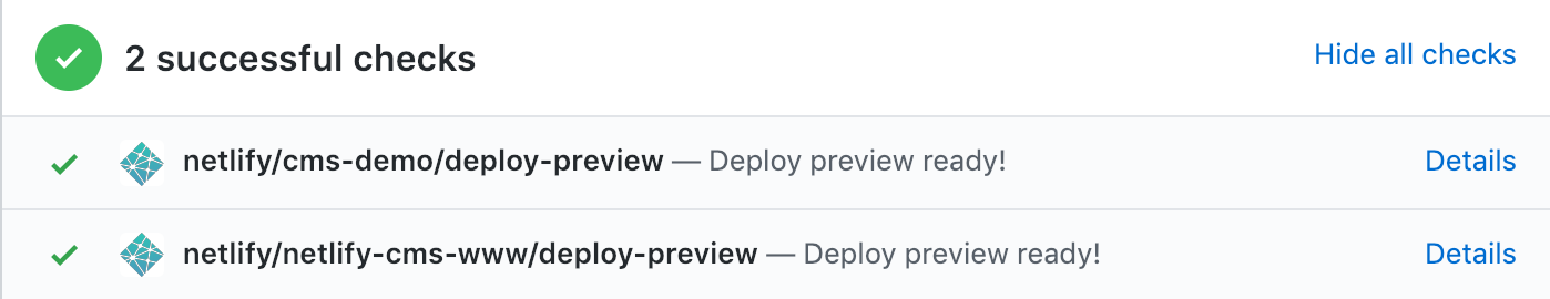
Deploy preview links can be disabled by setting show_preview_links to false.

Example:

show_preview_links: false

The search functionally requires loading all collection(s) entries, which can exhaust rate limits on large repositories. It can be disabled by setting the top level search property to false.

Defaults to true

Example:

search: false

Slug Type

The slug option allows you to change how filenames for entries are created and sanitized. It also applies to filenames of media inserted via the default media library.
For modifying the actual data in a slug, see the per-collection option below.

slug accepts multiple options:

  • encoding
    • unicode (default): Sanitize filenames (slugs) according to RFC3987 and the WHATWG URL spec. This spec allows non-ASCII (or non-Latin) characters to exist in URLs.
    • ascii: Sanitize filenames (slugs) according to RFC3986. The only allowed characters are (0-9, a-z, A-Z, _, -, ~).
  • clean_accents: Set to true to remove diacritics from slug characters before sanitizing. This is often helpful when using ascii encoding.
  • sanitize_replacement: The replacement string used to substitute unsafe characters, defaults to -.

Example

slug:
  encoding: "ascii"
  clean_accents: true
  sanitize_replacement: "_"

Collections

This setting is required.

The collections setting is the heart of your Netlify CMS configuration, as it determines how content types and editor fields in the UI generate files and content in your repository. Each collection you configure displays in the left sidebar of the Content page of the editor UI, in the order they are entered into your Netlify CMS config.yml file.

collections accepts a list of collection objects, each with the following options:

  • name (required): unique identifier for the collection, used as the key when referenced in other contexts (like the relation widget)
  • identifier_field: see detailed description below
  • label: label for the collection in the editor UI; defaults to the value of name
  • label_singular: singular label for certain elements in the editor; defaults to the value of label
  • description: optional text, displayed below the label when viewing a collection
  • files or folder (requires one of these): specifies the collection type and location; details in Collection Types
  • filter: optional filter for folder collections; details in Collection Types
  • create: for folder collections only; true allows users to create new items in the collection; defaults to false
  • publish: for publish_mode: editorial_workflow only; false hides UI publishing controls for a collection; defaults to true
  • hide: true hides a collection in the CMS UI; defaults to false. Useful when using the relation widget to hide referenced collections.
  • delete: false prevents users from deleting items in a collection; defaults to true
  • extension: see detailed description below
  • format: see detailed description below
  • frontmatter_delimiter: see detailed description under format
  • slug: see detailed description below
  • preview_path: see detailed description below
  • preview_path_date_field: see detailed description below
  • fields (required): see detailed description below
  • editor: see detailed description below
  • summary: see detailed description below
  • sortable_fields: see detailed description below
  • view_filters: see detailed description below
  • view_groups: see detailed description below

The last few options require more detailed information.

identifier_field

Netlify CMS expects every entry to provide a field named "title" that serves as an identifier for the entry. The identifier field serves as an entry’s title when viewing a list of entries, and is used in slug creation. If you would like to use a field other than "title" as the identifier, you can set identifier_field to the name of the other field.

Example

collections:
  - name: posts
    identifier_field: name

extension and format

These settings determine how collection files are parsed and saved. Both are optional—Netlify CMS will attempt to infer your settings based on existing items in the collection. If your collection is empty, or you’d like more control, you can set these fields explicitly.

extension determines the file extension searched for when finding existing entries in a folder collection and it determines the file extension used to save new collection items. It accepts the following values: yml, yaml, toml, json, md, markdown, html.

You may also specify a custom extension not included in the list above, as long as the collection files can be parsed and saved in one of the supported formats below.

format determines how collection files are parsed and saved. It will be inferred if the extension field or existing collection file extensions match one of the supported extensions above. It accepts the following values:

  • yml or yaml: parses and saves files as YAML-formatted data files; saves with yml extension by default
  • toml: parses and saves files as TOML-formatted data files; saves with toml extension by default
  • json: parses and saves files as JSON-formatted data files; saves with json extension by default
  • frontmatter: parses files and saves files with data frontmatter followed by an unparsed body text (edited using a body field); saves with md extension by default; default for collections that can’t be inferred. Collections with frontmatter format (either inferred or explicitly set) can parse files with frontmatter in YAML, TOML, or JSON format. However, they will be saved with YAML frontmatter.
  • yaml-frontmatter: same as the frontmatter format above, except frontmatter will be both parsed and saved only as YAML, followed by unparsed body text. The default delimiter for this option is ---.
  • toml-frontmatter: same as the frontmatter format above, except frontmatter will be both parsed and saved only as TOML, followed by unparsed body text. The default delimiter for this option is +++.
  • json-frontmatter: same as the frontmatter format above, except frontmatter will be both parsed and saved as JSON, followed by unparsed body text. The default delimiter for this option is { }.

frontmatter_delimiter

If you have an explicit frontmatter format declared, this option allows you to specify a custom delimiter like ~~~. If you need different beginning and ending delimiters, you can use an array like ["(", ")"].

slug

For folder collections where users can create new items, the slug option specifies a template for generating new filenames based on a file’s creation date and title field. (This means that all collections with create: true must have a title field (a different field can be used via identifier_field).

The slug template can also reference a field value by name, eg. {{title}}. If a field name conflicts with a built in template tag name – for example, if you have a field named slug, and would like to reference that field via {{slug}}, you can do so by adding the explicit fields. prefix, eg. {{fields.slug}}.

Available template tags:

  • Any field can be referenced by wrapping the field name in double curly braces, eg. {{author}}
  • {{slug}}: a url-safe version of the title field (or identifier field) for the file
  • {{year}}: 4-digit year of the file creation date
  • {{month}}: 2-digit month of the file creation date
  • {{day}}: 2-digit day of the month of the file creation date
  • {{hour}}: 2-digit hour of the file creation date
  • {{minute}}: 2-digit minute of the file creation date
  • {{second}}: 2-digit second of the file creation date

Example:

slug: "{{year}}-{{month}}-{{day}}_{{slug}}"

Example using field names:

slug: "{{year}}-{{month}}-{{day}}_{{title}}_{{some_other_field}}"

Example using field name that conflicts with a template tag:

slug: "{{year}}-{{month}}-{{day}}_{{fields.slug}}"
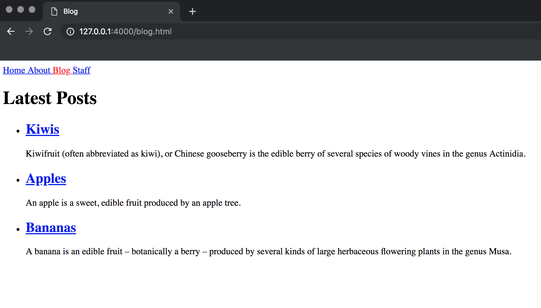
preview_path

A string representing the path where content in this collection can be found on the live site. This allows deploy preview links to direct to lead to a specific piece of content rather than the site root of a deploy preview.

Available template tags:

Template tags are the same as those for slug, with the following exceptions:

  • {{slug}} is the entire slug for the current entry (not just the url-safe identifier, as is the case with slug configuration)
  • The date based template tags, such as {{year}} and {{month}}, are pulled from a date field in your entry, and may require additional configuration – see preview_path_date_field for details. If a date template tag is used and no date can be found, preview_path will be ignored.
  • {{dirname}} The path to the file’s parent directory, relative to the collection’s folder.
  • {{filename}} The file name without the extension part.
  • {{extension}} The file extension.

Examples:

collections:
  - name: posts
    preview_path: "blog/{{year}}/{{month}}/{{slug}}"
collections:
  - name: posts
    preview_path: "blog/{{year}}/{{month}}/{{filename}}.{{extension}}"

preview_path_date_field

The name of a date field for parsing date-based template tags from preview_path. If this field is not provided and preview_path contains date-based template tags (eg. {{year}}), Netlify CMS will attempt to infer a usable date field by checking for common date field names, such as date. If you find that you need to specify a date field, you can use preview_path_date_field to tell Netlify CMS which field to use for preview path template tags.

Example:

collections:
  - name: posts
    preview_path_date_field: "updated_on"

fields

The fields option maps editor UI widgets to field-value pairs in the saved file. The order of the fields in your Netlify CMS config.yml file determines their order in the editor UI and in the saved file.

fields accepts a list of collection objects, each with the following options:

  • name (required): unique identifier for the field, used as the key when referenced in other contexts (like the relation widget)
  • label: label for the field in the editor UI; defaults to the value of name
  • widget: defines editor UI and inputs and file field data types; details in Widgets
  • default: specify a default value for a field; available for most widget types (see Widgets for details on each widget type). Please note that field default value only works for folder collection type.
  • required: specify as false to make a field optional; defaults to true
  • pattern: add field validation by specifying a list with a regex pattern and an error message; more extensive validation can be achieved with custom widgets
  • comment: optional comment to add before the field (only supported for yaml)

In files with frontmatter, one field should be named body. This special field represents the section of the document (usually markdown) that comes after the frontmatter.

Example:

fields:
  - label: "Title"
    name: "title"
    widget: "string"
    pattern: ['.{20,}', "Must have at least 20 characters"]
  - {label: "Layout", name: "layout", widget: "hidden", default: "blog"}
  - {label: "Featured Image", name: "thumbnail", widget: "image", required: false}
  - {label: "Body", name: "body", widget: "markdown"}
    comment: 'This is a multiline\ncomment'

editor

This setting changes options for the editor view of a collection or a file inside a files collection. It has one option so far:

  • preview: set to false to disable the preview pane for this collection or file; defaults to true

Example:

  editor:
     preview: false

Note: Setting this as a top level configuration will set the default for all collections

summary

This setting allows the customization of the collection list view. Similar to the slug field, a string with templates can be used to include values of different fields, e.g. {{title}}. This option over-rides the default of title field and identifier_field.

Available template tags:

Template tags are the same as those for slug, with the following additions:

  • {{dirname}} The path to the file’s parent directory, relative to the collection’s folder.
  • {{filename}} The file name without the extension part.
  • {{extension}} The file extension.
  • {{commit_date}} The file commit date on supported backends (git based backends).
  • {{commit_author}} The file author date on supported backends (git based backends).

Example

    summary: "Version: {{version}} - {{title}}"

sortable_fields

An optional list of sort fields to show in the UI.

Defaults to inferring title, date, author and description fields and will also show Update On sort field in git based backends.

When author field can’t be inferred commit author will be used.

Example

    # use dot notation for nested fields
    sortable_fields: ['commit_date', 'title', 'commit_author', 'language.en']

view_filters

An optional list of predefined view filters to show in the UI.

Defaults to an empty list.

Example

    view_filters:
      - label: "Alice's and Bob's Posts"
        field: author
        pattern: 'Alice|Bob'
      - label: 'Posts published in 2020'
        field: date
        pattern: '2020'
      - label: Drafts
        field: draft
        pattern: true

view_groups

An optional list of predefined view groups to show in the UI.

Defaults to an empty list.

Example

    view_groups:
      - label: Year
        field: date
        # groups items based on the value matched by the pattern
        pattern: \d{4}
      - label: Drafts
        field: draft